LOWE’S:
SPRINGFEST
BRAND
Lowe’s
AGENCY
DeutschLA
ROLE
Design, Art Direction

CONTEXT
SpringFest is Lowe's seasonal event that celebrates the arrival of spring and highlights a variety of products to refresh your home. This event spans the entire spring season and is promoted through physical stores, out-of-home (OOH) advertising, and comprehensive 360 digital campaigns.
SOLUTION
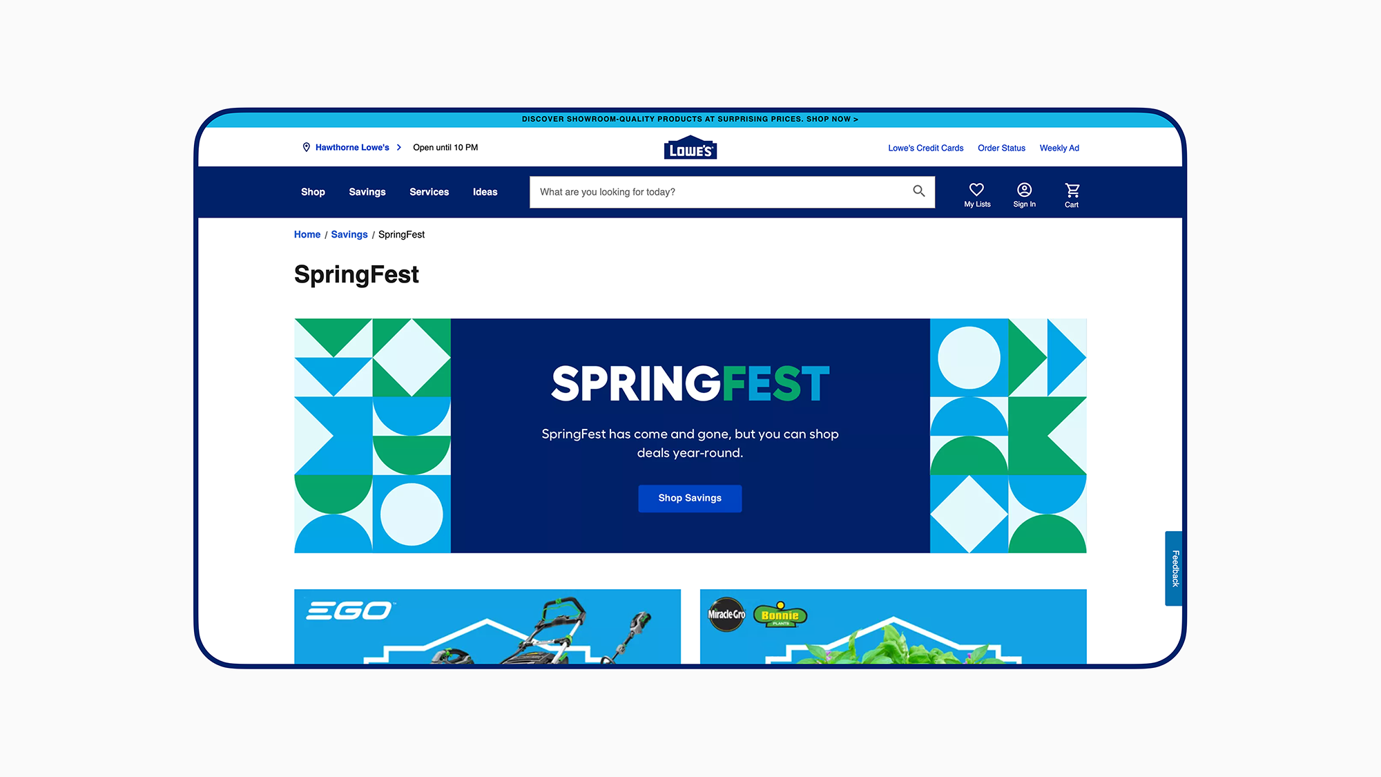
To capture the essence of SpringFest, we have developed a new visual identity that aligns with Lowe's latest branding. This identity features a clean and graphical aesthetic, infused with a festive and decorative vibe. The design approach aims to create anticipation and excitement for SpringFest as a special occasion worth celebrating from both the inside and out.
LOGO
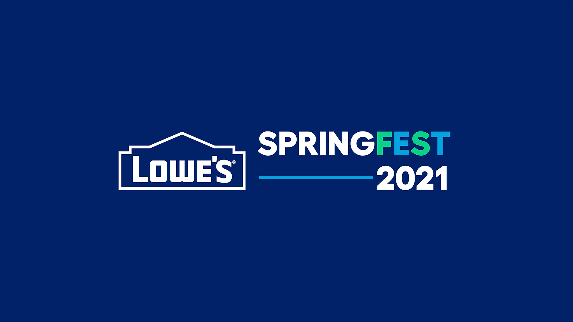
The primary logo for Lowe's SpringFest showcases the visual identity of the event, emphasizing the theme of creating a backyard oasis. It is bold and straightforward, utilizing Lowe's brand colors and incorporating a vibrant Spring Green hue.
The primary logo for Lowe's SpringFest showcases the visual identity of the event, emphasizing the theme of creating a backyard oasis. It is bold and straightforward, utilizing Lowe's brand colors and incorporating a vibrant Spring Green hue.

COLOR PALETTE

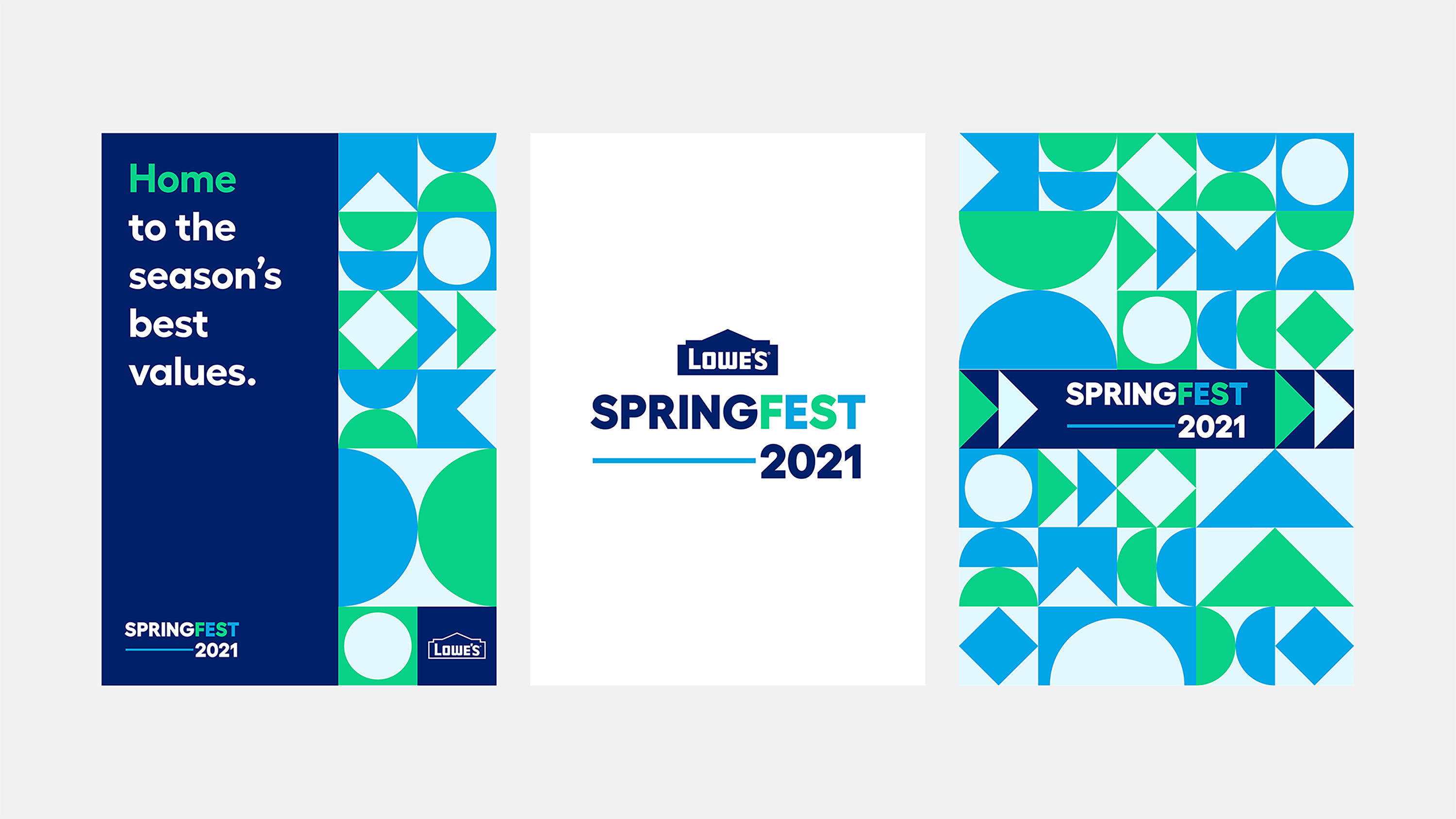
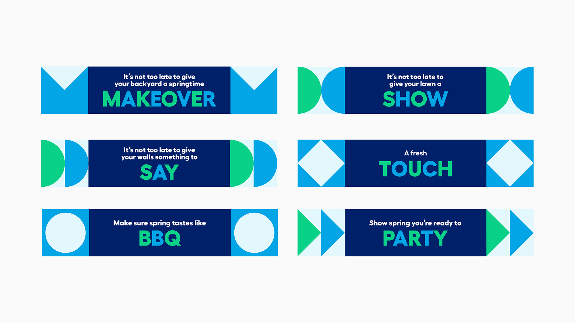
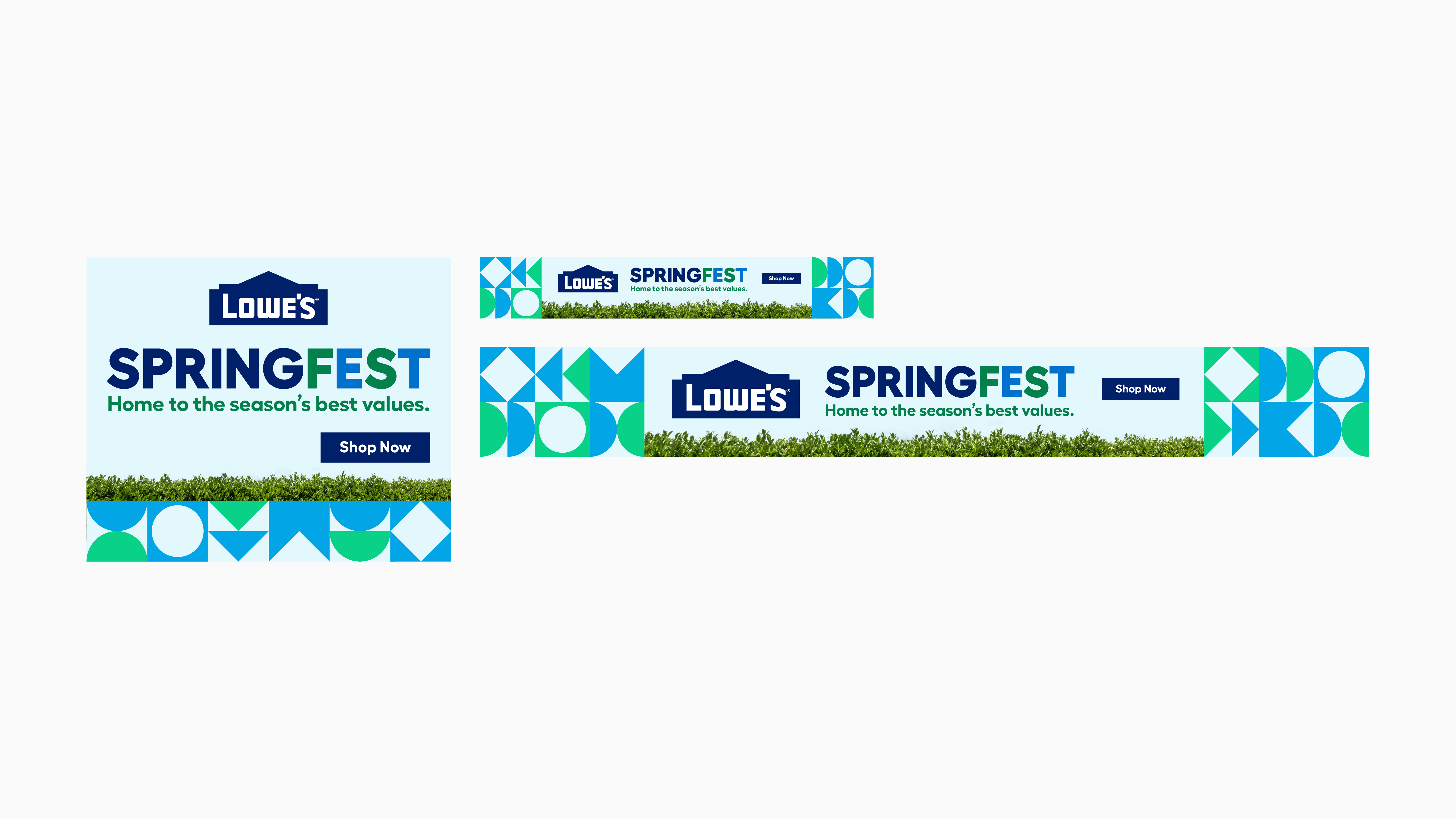
To maintain a distinct look for Lowe’s SpringFest2021, the new design system incorporates graphic elements that symbolize nature and spring. The patterns, used alongside rounded patterns, will create a bold and ownable visual system.

IN-STORE APPLICATION

DIGITAL APPLICATION

GUIDELINES
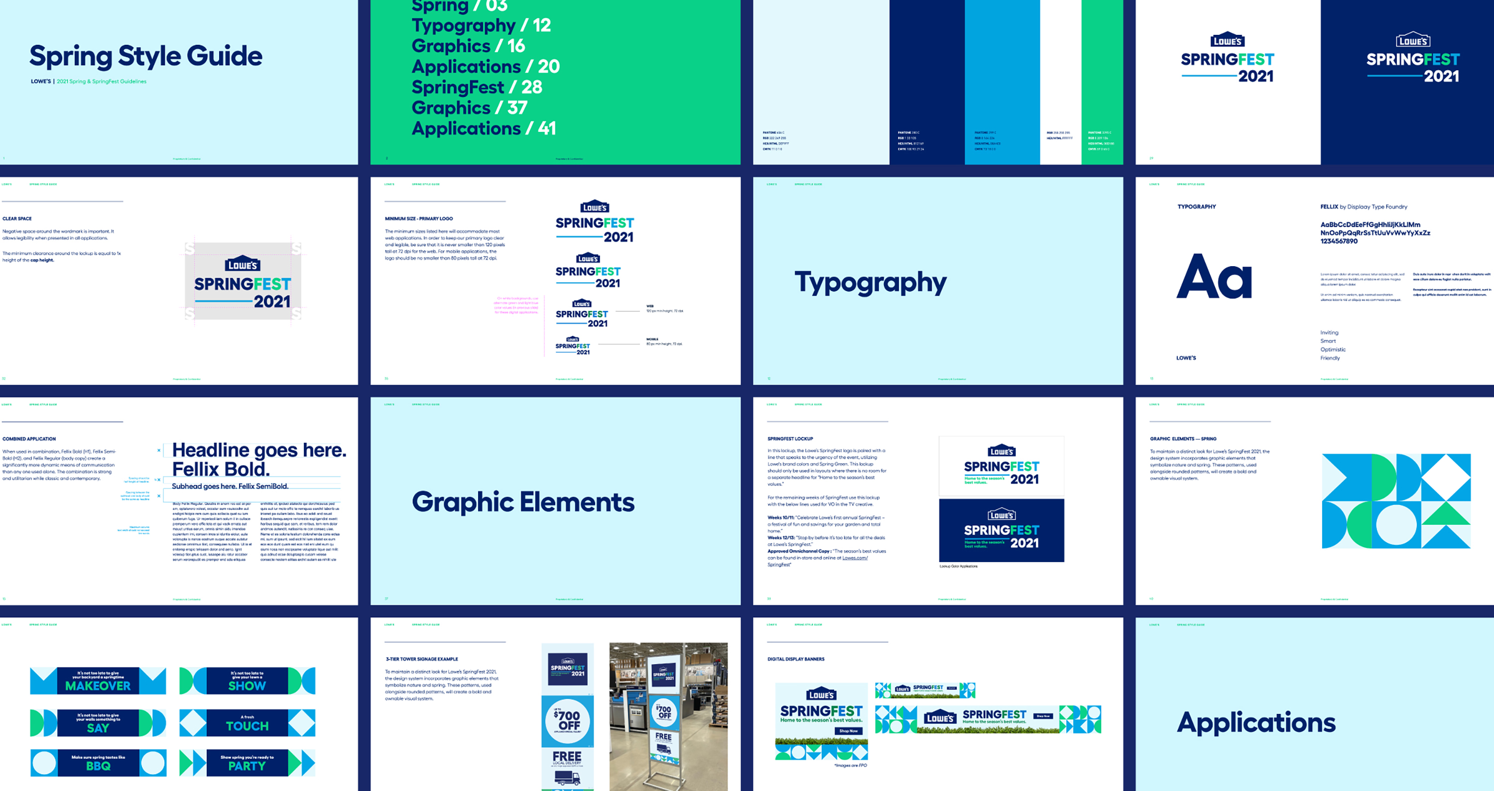
We also provided a 60-pages Style Guide to introduce the essential elements of the SpringFest2021 identity system and explain how to use them to build the brand in order to maintain the consistent but ownable look for Lowe’s.
We also provided a 60-pages Style Guide to introduce the essential elements of the SpringFest2021 identity system and explain how to use them to build the brand in order to maintain the consistent but ownable look for Lowe’s.
COMMERCIAL